
How to Create a Moodboard That Actually Translates Into Branding
- Ana Rojas
- Jul 31, 2025
- 2 min read

We’ve all made one: a “vibe” board full of stunning Pinterest pics, chic fonts, and color swatches that feel ✨aesthetic✨… but then you sit down to design your logo or website and… nothing clicks.
At Spatial, we believe moodboards should do more than look pretty. They should guide decisions, not just collect inspiration.
Here’s how to build a moodboard that actually leads to a cohesive, scroll-stopping brand identity:

🔑 1. Start With Strategy, Not Aesthetic
Before you open Pinterest, ask yourself:
What feeling do I want my brand to evoke?
What values do I want reflected in my visuals?
Who is my ideal customer and what are they drawn to?
This anchors your visual choices with intention. If your brand is bold and playful, a neutral, beige-heavy board won’t match—no matter how on-trend it is.

🎨 2. Find Visuals With Purpose
Don’t just save “pretty” images. Save with these categories in mind:
Color + Texture: What shades repeat? Matte vs glossy? Natural vs polished?
Typography Style: Serif elegance? Bold sans-serif? Handwritten?
Brand Feel: What emotion does each image give? (Calm? Confident? Clean?)
Cultural Reference Points: Fashion campaigns, editorials, storefronts, etc.
This creates a layered board that communicates not just what you like, but why it works.

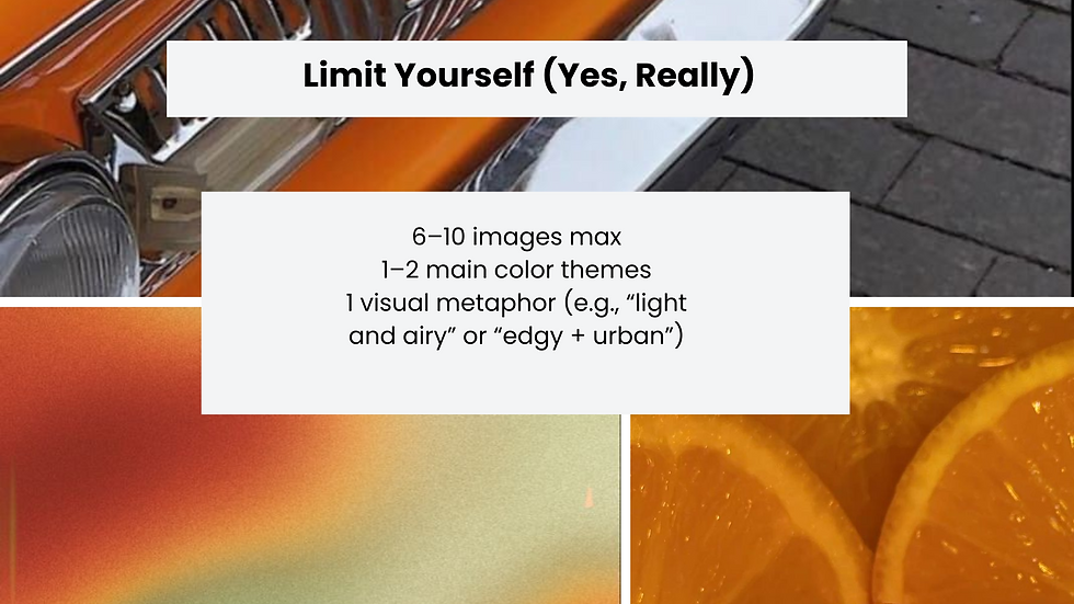
🧠 3. Limit Yourself (Yes, Really)
One of the most iconic traits of good branding? Restraint.
Narrow your final moodboard to:
6–10 images max
1–2 main color themes
1 visual metaphor (e.g., “light and airy” or “edgy + urban”)
It’s not about capturing everything—it’s about creating clarity.
🔄 4. Translate Your Moodboard Into Action
Here’s where the magic happens:
Turn your dominant colors into your palette
Let the mood inspire your font choices (modern? retro?)
Use layout references for your web design or packaging
A good moodboard gives you a creative direction, not just inspiration.

👀 Bonus Tip: Include “Anti-Vibes”
Sometimes what your brand isn’t is just as helpful. Include 1–2 “off-brand” examples that help clarify your line. This keeps your future visuals consistent—and helps any designer (👋 hi!) work more efficiently with you.
Ready to Build a Brand That Feels as Good as It Looks?
At Spatial, we help beauty, fashion, and lifestyle brands turn good ideas into unforgettable identities—starting with a moodboard that actually means something.
💌 Reach out to work together or get a brand consultation: a.rojas@spatialcreativestudio.com


Comments